
LEME is a workshop of leather & metal. The products are rough style and natural. Therefore, I used gradually layer of colours and animals images to make it wild.
There are two different types which are in Mandarin and English.
Logo Design
Simple but not simple.


For the Shan-Jiao community, I designed a number of logos and names. The colours of Lin grass and brick were used, and I was trying to combine the triangle shape of Lin grass’s cross-section. Make every gene of this brand related with an easy shape - triangle.

Ve-Lin is our team’s name, which is express that we are not afraid of cold! While my team attended the Stationed-in-rural community project, I named our team this name. And the word “Lin” was also the main element – Lin grass.
Sushi Express is a famous chain restaurant in Taiwan. The dinning mode they provide is putting sushi on automatic conveyor belts and customers can choose whatever they want, bringing it on their own table. The characteristics are fresh seafood, fun and interesting atmosphere. I transformed the Mandarin letters of Sushi Express to sushi like and thumb to imply the company. The vibrant colours showed how their ingredients were extremely fresh.
This logo was made for a Study Tour Company which was just getting started.
The main demand of the boss was to use the images of eagle and kangaroo, The eagle showed their broad vision, ambitious and the kangaroo meant they would always look after every single member as kangaroos’ kids in their pouch. Therefore, I used dynamic curves to emerge the abundant energy. Only one eye but both for the eagle and the kangaroo made them focus on the same goal. The kangaroo’s lags were also the feathers of the eagle. And an energetic logo for study tour was born.

The Green Advertisement Convenient Umbrella project was about to set a contract with convenient store, e.g. 7-ELEVEN, Family mart and OK, and place umbrella sets in many convenient stores where let consumers rent the umbrella in a cheap prize if they suddenly need it. The business model is simply using the surface on the umbrellas as an advertisement, and when people use them, they would see the images or words which we want to express, and also let other people surround them notice it at the same time. The ink on the surfaces is washable, so we can put various advisements at different schedule.

ARC is the abbreviation of Advanced Research Center, which was a lab researching elderly care with high technology. The elderly is symbolized in orange which the main colour I used. Sharp and continuous curves were used to present high technology.

This cobra is the symbol of myself which I changed the letters of my Mandarin name 尚伯. The year which I was born in was the year of snake, and I always wish myself to be flexible, calm, offensive and smart as a cobra. .

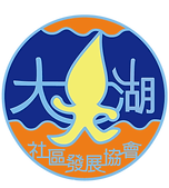
The water source is an important characteristic in Da-Hu community. The community development committee wanted to create an energetic icon to establish them. Therefore, I used a lively water elves as the emblem.
